Enhancing user experience: usability evaluation and design improvement of an AAC app.
I evaluated the usability and usefulness of Livox (a AAC app for android tablets) through a multi-faceted research approach, including heuristic evaluation, usability testing, and user surveys. The study culminated in targeted design improvements for crucial screens as well as insights to consider in the future strategic direction of the app’s development.
User Research
UX/UI Design
Livox is an AAC (Augmentative and Alternative Communication) app for Android tablets. It enables people with special needs to communicate by tapping on symbols or pictures, which then trigger computer-generated speech.
Stakeholders
This project was a collaboration between The Scott Center for Autism Treatment — which specializes in providing therapy for children with autism — and MindsUntapped, Inc., the holders of the distribution rights for Livox in the USA.
Project Goals
Our goal was to evaluate the app's overall usability and its specific usefulness for individuals with autism.
Role
Plan and conduct the usability study while coordinating with key stakeholders: the company, the autism treatment center, and the children's caregivers.
Propose design improvements for the identified issues.
Constraints
Working with children who have autism requires delicate handling and professional qualifications I lack. As a result, this project posed unique challenges and limitations:
Inability to integrate Livox into therapy sessions at the autism center (therapeutic procedures are strictly regulated, and there were concerns about interfering with established protocols).
Parents who agreed to participate in the study would use the tablet during hours that wouldn't interfere with therapy sessions (e.g., at home, school, parks, etc.).
Difficulty in scheduling frequent meetings with parents due to their extremely busy schedules.
Considering the general constraints, I adopted a three-pronged approach
Heuristic Evaluation
Usability Testing with users (outside the autism center)
A survey (sent to participating parents after a 6 weeks usage period)
Heuristic Evaluation
After exploring the app with the heuristics in mind, I identified a total of 29 issues.
2
Critical
13
Major
14
Minor
Critical: are issues that literally make the user unable to proceed.
Major: reflect issues that heavily impact the user experience resulting in user frustration and demanding high cognitive effort to overcome
Minor: Reflect problems that do not heavily impact the user experience and users can easily overcome
Usability Testing
6 participants for usability testing sessions. My main criterion was selecting individuals knowledgeable about usability for the following reasons:
The app itself is not domain-specific. Anyone caring for a child with autism can potentially become a user. Therefore, I assumed that any user should be able to navigate the app without necessarily possessing in-depth knowledge about autism
Selecting participants knowledgeable about usability enables richer feedback with a smaller sample size.
The usability testing sessions were video-recorded and followed a two-step process:
First, participants were given carefully curated tasks of increasing complexity, guiding them through all possible actions within the app.
Propose design improvements for the identified issues.
Survey with Parents
6 parents were recruited to use Livox with their children for six weeks. After this period, we sent them an online survey.
The questions were primarily open-ended to elicit richer feedback, given the relatively small sample size. We included some closed-ended questions among the open-ended ones to break the pattern and prevent respondents from becoming discouraged and abandoning the survey.
The survey questions covered various aspects, including the child's engagement level, the app's effectiveness and ease of use, its features, and overall user satisfaction.
Research Findings
The heuristic evaluation, usability testing, and survey responses revealed key weaknesses and generated opportunities for improvement:
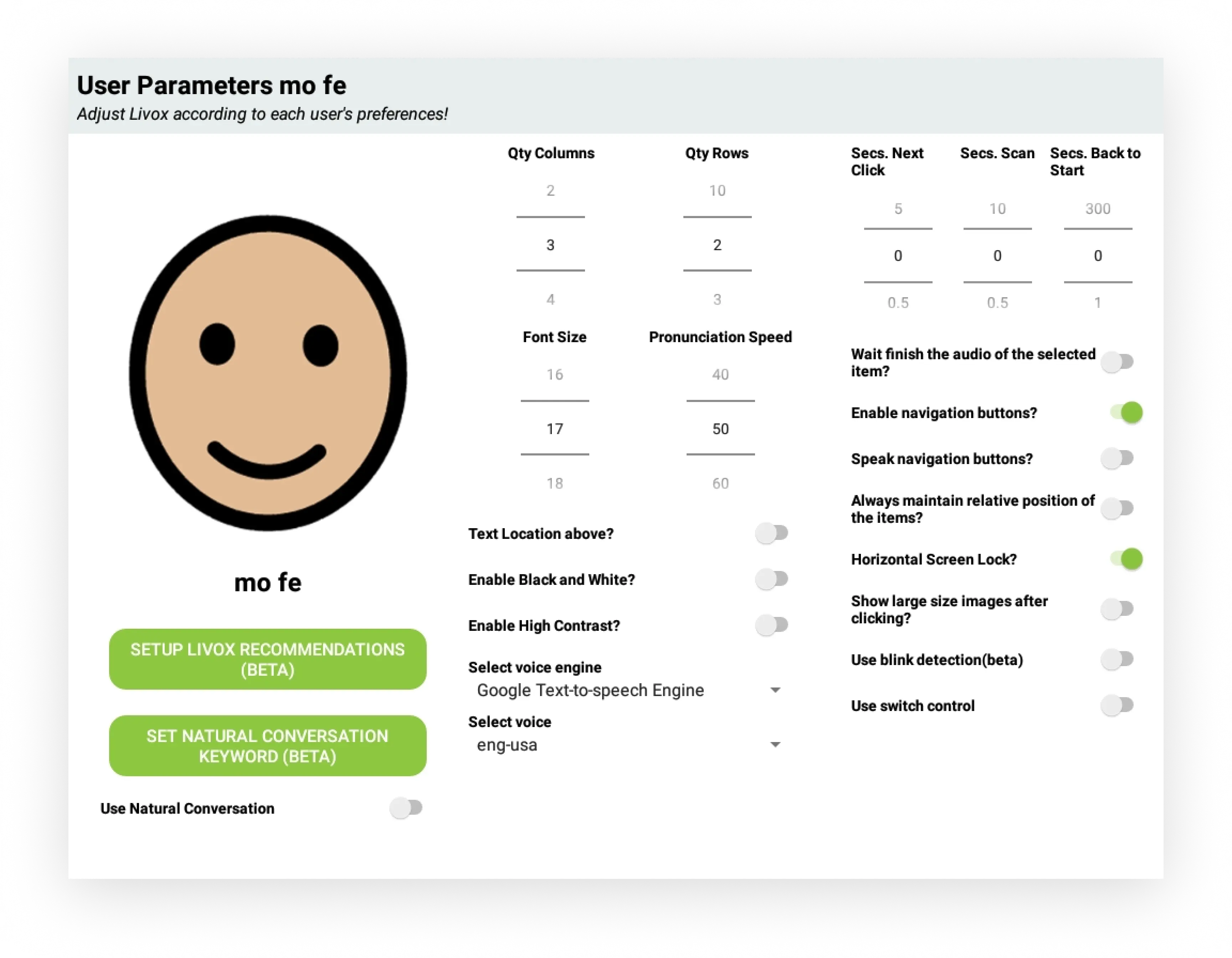
The "Parameters" and "Item Creation" screens display numerous usability issues related to UI and information architecture. These screens are vital, as they enable caregivers and users to configure the app and add items. The excessive friction in these crucial screens significantly hinders adoption, retention, and overall usability.
Livox is currently more suitable for beginners (people just starting to develop language). In fact, the app doesn't scale well to accommodate more skilled users in terms of linguistic levels.
Item Creation Screen
Before redesign
After Redesign
Gestalt principles of proximity and closure were applied to chunk and group related content and isolate them from other groups of content.
A thumbnail grid was introduced on the left side of the screen that shows more pictures at a given time with clear concise labels
Icons for deleting, accessing gallery, and camera have been introduced next to the selected image. I also added module tabs to differentiate between the selection of primary and secondary pictures to avoid confusion. Given that assigning a secondary picture is not a frequent action, it is disabled by default.
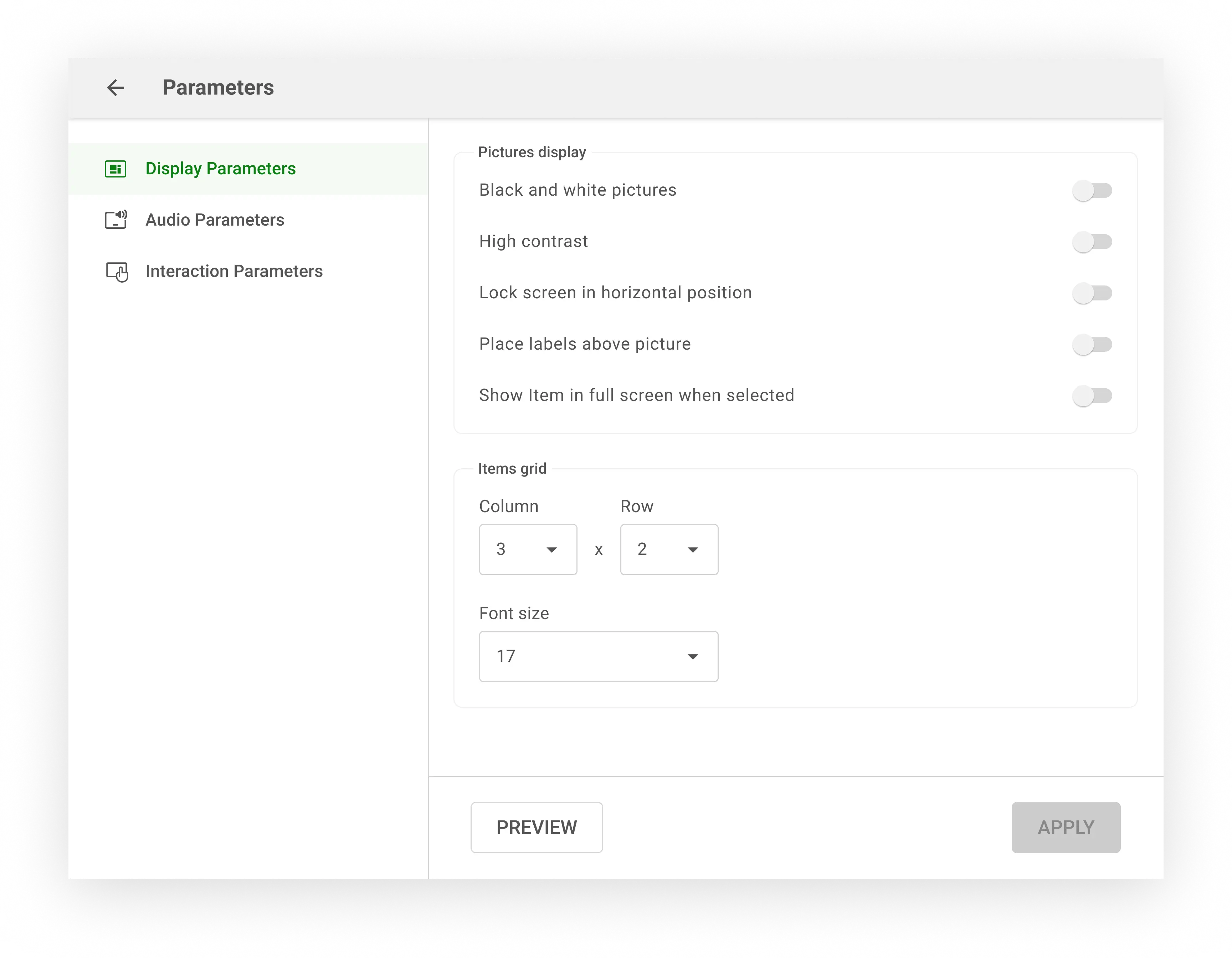
Parameters Screen
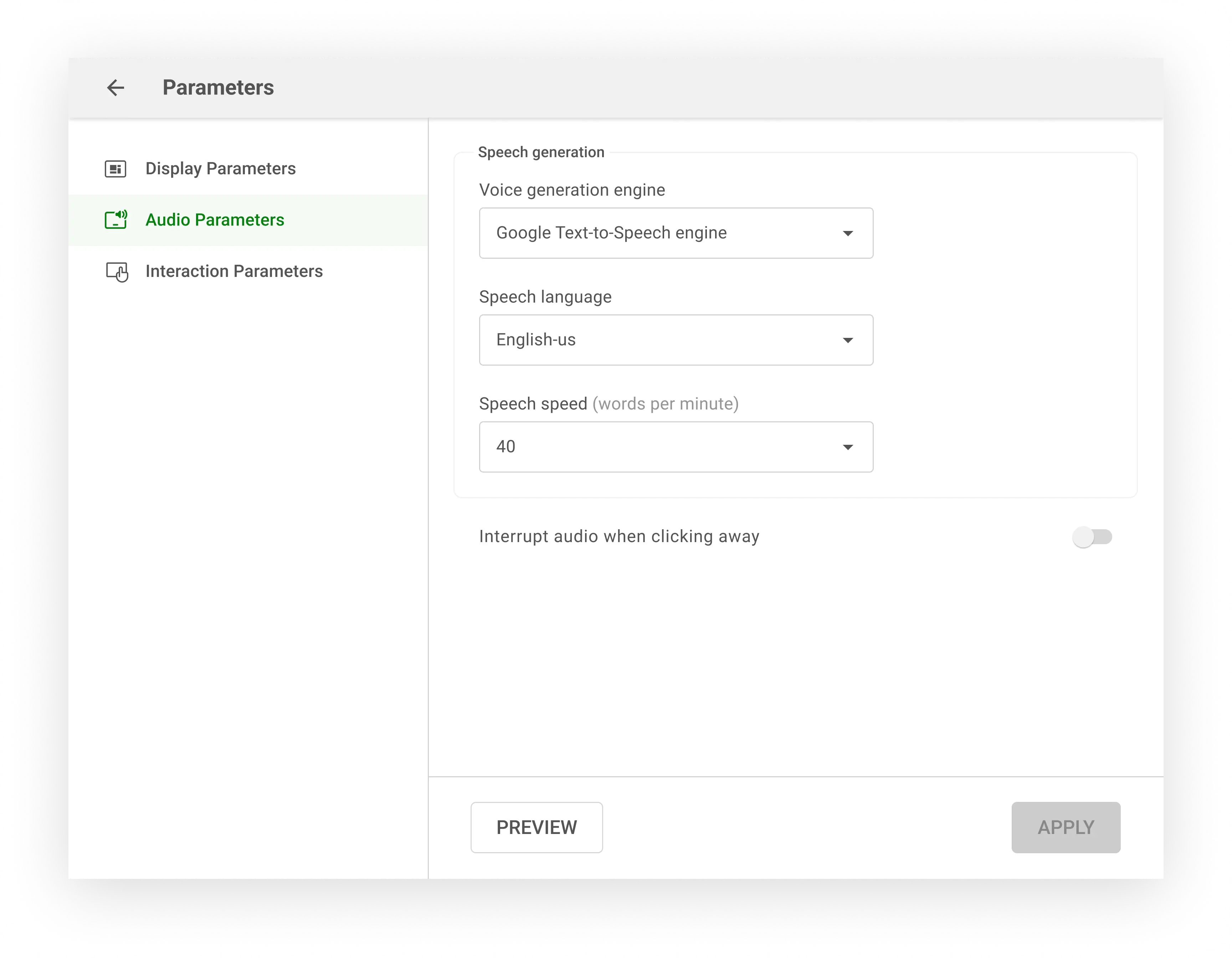
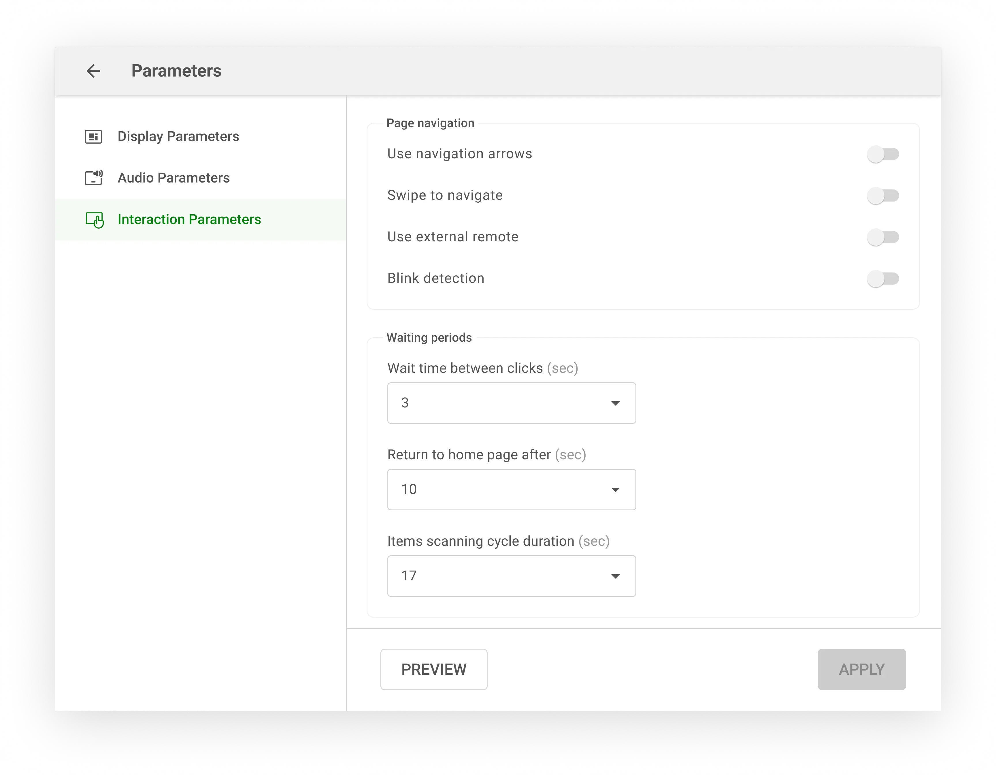
The redesign transformed a single cluttered screen into three distinct tabs on the left side, each dedicated to a specific type of parameter: Display, Audio, and Interaction.
Within these tabs, related elements were grouped into titled sections, enhancing ease of retrieval.
The text's font size, length, and structure were optimized for better readability.
We added "Cancel" and "Preview" buttons, allowing users to test settings before committing, thus preventing unintended changes.
After implementing the redesigns, I reconnected with therapists and caregivers for feedback on the prototypes. Their response was overwhelmingly positive, confirming that the previously experienced confusions would be resolved.
This research also uncovered insights crucial for the app's future success. It heightened the team's awareness and sense of urgency to address scalability limitations, especially in catering to users with more advanced language skills. As a result, the focus shifted from feature expansion to prioritizing this fundamental improvement.


