Bridging the gap between diagnosis and action.
Empowering Salesforce professionals, across all levels of technical expertise, to access the right level of information detail based on their needs and context and quickly transform insights into actions.
This project played a key role in achieving a 70% ARR increase over 4 months.
User Research
UX/UI Design
Data Viz
Salesforce

Context
Problem Space
Research
Personas
While it may seem that all our users are simply Salesforce professionals, our ongoing research revealed distinct user categories. The first consists of Admins, who manage day-to-day systems internally within organizations. The second encompasses consultants, split into two types: Pre-sales consultants who work as external resources before projects begin, and Managed Services consultants who maintain systems post-implementation.
These three types of users, though all Salesforce professionals, have distinct enough contextual needs and usage patterns that they warrant tailored consideration.
Below are the key differences between the 3 personas (Admin, Pre-sales, Managed services):
All 3 have different skills, Salesforce technical knowledge, and areas of expertise.
They need the product for different purposes, at different times and for a different number of orgs.
They have different frequency of use.
They all interact with stakeholders that have different Salesforce knowledge, ranging from none to expert.
The persona work that we did was not specific to this particular project but an ongoing effort and continuously evolving that has started before some of issues discussed in this projects emerged. It was not only useful in influencing the content of many dashboards, but also has had tremendous impact on defining the business model that has also seen a few iterations, because persona derives a unique value from the use of the product.
User Feedback
Through user interviews and feedback sessions, we uncovered a disparity in how different users interacted with the dashboards that are particularly complex. Those with advanced technical knowledge and deep Salesforce expertise could effectively analyze the data, interpret patterns, and formulate action plans. However, users with intermediate or basic technical backgrounds - who represented a substantial portion of our user base - found themselves overwhelmed by the wealth of information. These users frequently showed uncertainty about prioritizing and addressing the identified issues, often responding with comments like:
"Ok, great! We identified all these issues, now what? Where do I start?"
This feedback pattern revealed a crucial gap in our product's ability to serve users across different technical proficiency levels, highlighting the need for a more inclusive and guided approach to fixing the identified issues.
Impact of General UI Design Constraints
To optimize for speed of delivery and release, the team opted to use Tableau for data visualization. Using Tableau, which became part of the Salesforce ecosystem since its acquisition, certainly provides a significant set of advantages. There are however also drawbacks that should be mentioned and worked around.
Advantages
Excellent Salesforce integration through native connectors and seamless data flow.
Capable of pulling real-time data from Salesforce and handle large datasets.
Interactive dashboard features that enable data drill-down and filtering.
Drawbacks
Limited visual design capabilities
Although they are technically responsive, the containers for individual graphs in a dashboard cannot be assigned a min-max width. The automatic responsiveness results in inconsistent dashboard layouts between scan results.
Due to the limitations that come with Tableau, especially the responsiveness, we had to implement a fixed-size frame for the dashboards (1000px x 1300px) and lock the layout of individual graphs within them. While users can scroll through individual graphs, the dashboard itself is not scrollable.
During the design dashboard design process, we worked closely with our data analyst to understand Tableau's visualization capabilities and limitations, ensuring we only designed things that could be implemented.
Problems Summary
To summarize the problems we were facing at the time:
We have users that struggled with interpreting and acting on some of the identified issues in their Salesforce org.
Users needed varying levels of detail - from high-level overviews to granular data - depending on their context.
Additionally we were subject to more fundamental problems:
Very limited space for dashboard design, which always presents the risk for cluttered dashboards.
Growing number of dashboards due to the extensive data we needed to display.
We have instances where graphs that semantically and contextually belong together, appeared on different dashboards due to space constraints.
Solution
To address the challenge of users feeling unsure of next steps to take to fix the identified, we decided to design a dashboard that seamlessly links identified problems with specific recommendations to fix them. We called this the Recommendations dashboard.
But first, I tackled the information architecture and layout challenges as a foundation. I used the new Recommendations dashboard as a pilot for these improvements.
Improving Information Architecture
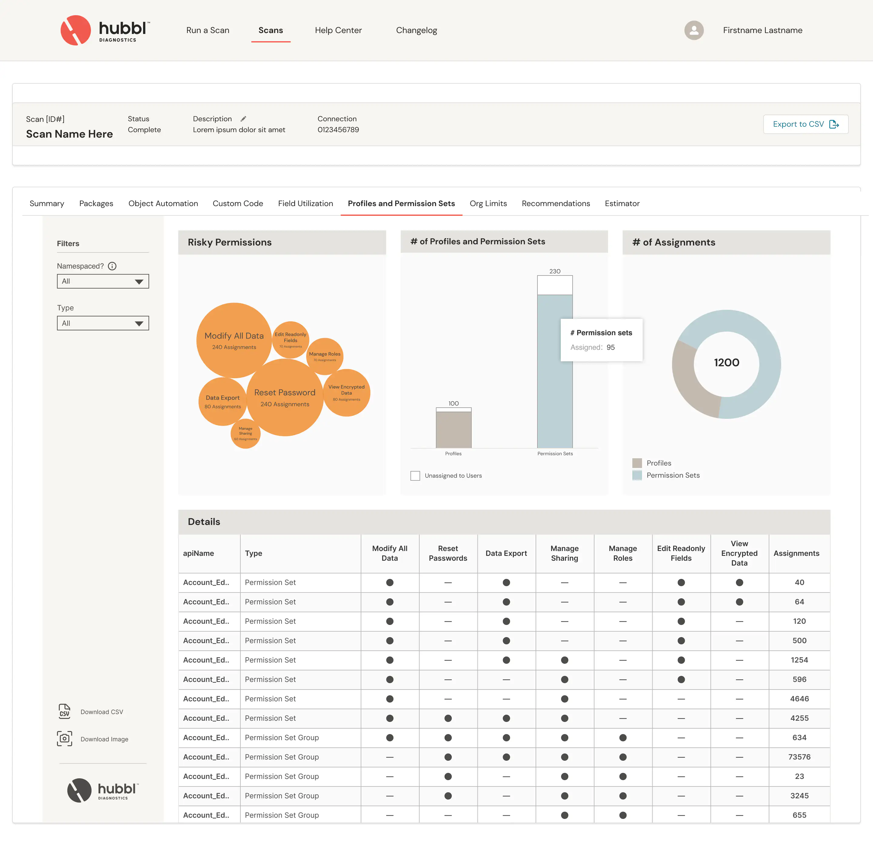
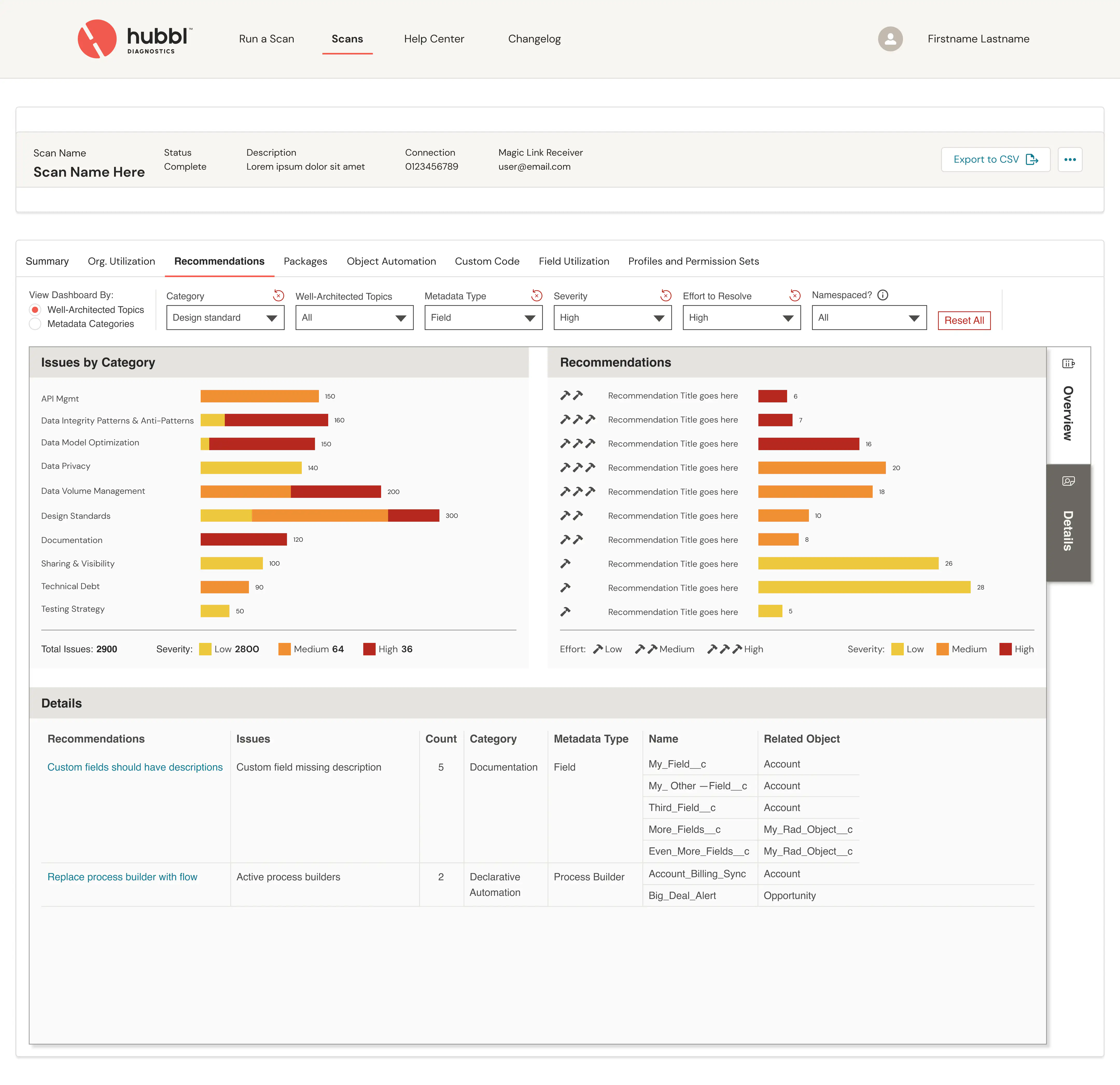
Changing the filters position
I relocated the filters from a vertical column on the left to a horizontal row at the top of the graphs. This change provides more space for the graphs in the dashboard. I noticed most other dashboards only use a few filters, keeping them in a vertical column would waste valuable screen space.
Introducing sections
I introduced tabs on the right to break down dashboard information into different levels of detail. This eliminated the need to compromise between high-level information and detailed tables within our limited space. Each dashboard now includes an overview section with general information, while users can access more specific details by clicking through to dedicated detail sections.
This approach enhances dashboard scalability and creates space for planned future features, such as Trends that will show how scan results vary over time for each dashboard.


Recommendations Dashboard
The changes to information architecture described above were adopted for the Recommendations dashboard.
Overview Section
Issues by category
Issues are organized into categories and displayed in a donut chart, where each segment represents a category. Users can click any segment to filter all other dashboard graphs to show only that category's data.
Issues severity vs Effort
This matrix plots the number issues along two axes:
The severity axis shows how much an issue impacts the system's performance, security, permissions, and/or other critical aspects.
The effort axis indicates how complex an issue is to fix.
This visualization helps users better understand the overall severity of issues and plan resource allocation effectively.
For example, looking at the top-left box, users can quickly identify "quick wins" — high-severity issues that require low effort — and assign them to team members with the appropriate technical expertise.
Recommendations
A graph that lists recommendations (actions to take) to fix issues, sorted by severity, showing the number of instances where each recommendation needs to be applied as well as an indication of the complexity of implementation.
When users click elements in other graphs within this dashboard, this list filters automatically, providing a focused set of recommendations. Users can then tackle issues based on their existing priorities and roadmaps, or use this dashboard to create a new action plan.


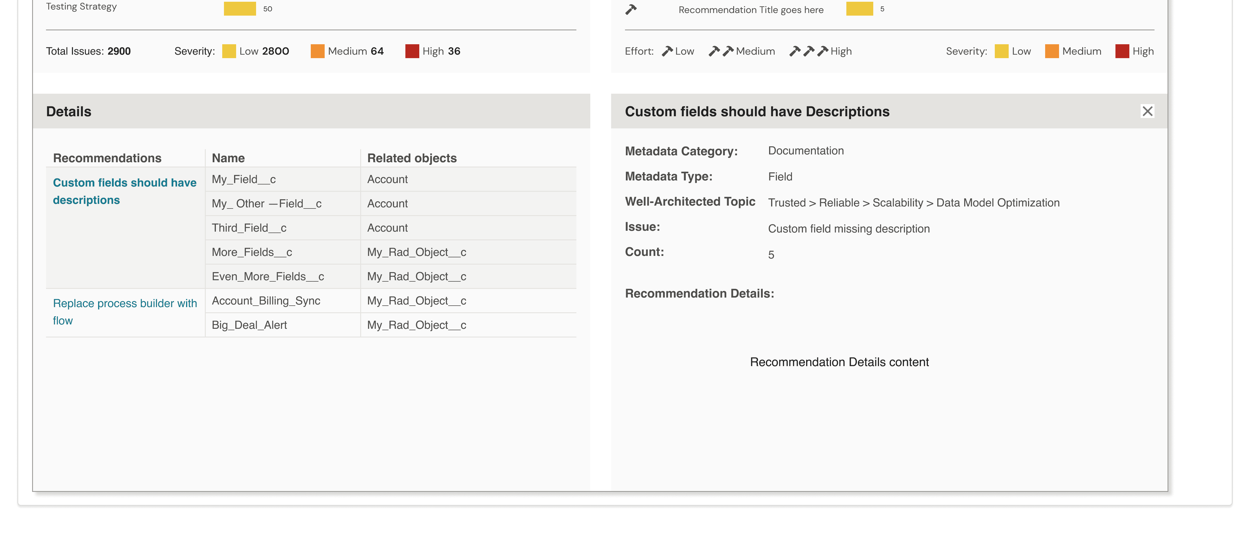
Details Section
Rather than dedicating a full page to the recommendations details table, we opted to sacrifice some table space in favor of granular filtering capabilities. This enables users to explore recommendation details and tutorials while maintaining their context—eliminating the need to switch between overview and details sections. Maintaining context is essential for the user experience since it reduces clicks, minimizes context switching, and decreases cognitive load. We found this tradeoff of space to be worthwhile given these usability benefits.

When users click a recommendation title, the table splits into two sections: a condensed recommendations table on the left with fewer columns, and a detailed view on the right showing specific implementation instructions and resources for the selected recommendation.


Impact
This project's design delivered several key benefits:
Increased usable dashboard space across the platform
Streamlined dashboard organization - By using sections within dashboards, we eliminated the need to create separate dashboards solely because we ran out of space. Contextually and semantically related graphs now live together in the same dashboard, using different sections.
Added layered information structure that provides different levels of detail to meet each user persona's needs
Faster insight discovery through the new overview section for each dashboard.
Increased conversion of insights into actions with the Recommendations dashboard
Enhanced user confidence and efficiency in issue resolution
My time with the Hubbl team involved working on several other dashboards
For a deeper dive on this project or any other one, you are welcome to reach out at mfessi.connect@gmail.com